
Logos & Branding
Logos, Icons, & Mascots
























Logo Design Process & Brand Handbook
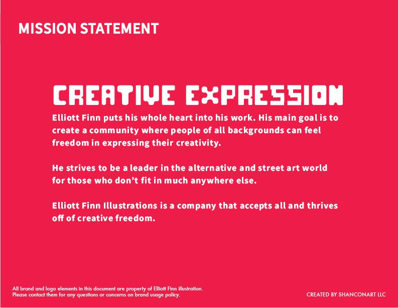
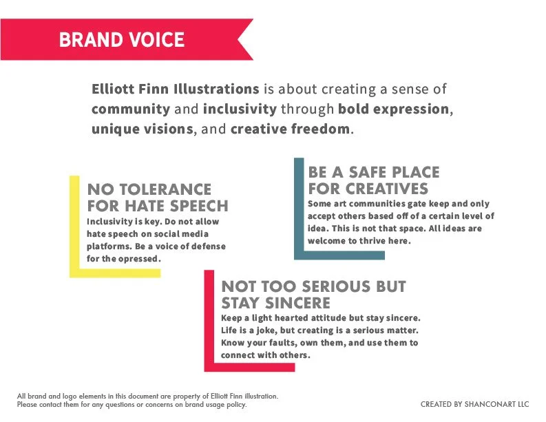
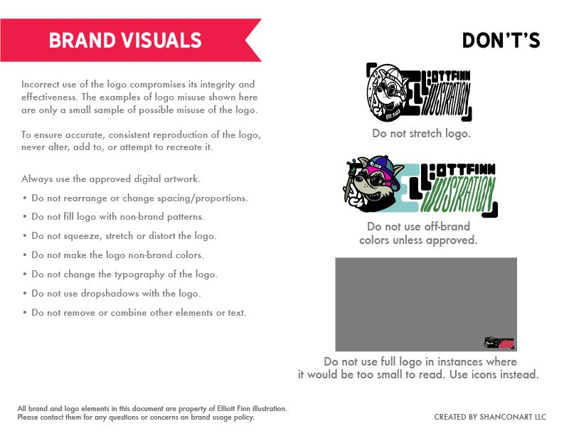
This project is an example of my design process for creating custom logos and brand handbooks. I start with research, sketching and exploration, and expansion on ideas that work. This process happens in black and white. Then, I research and explore color options that work with the design and goals of the brand. My brand handbooks include exploration of mission statements, identity, using your brand’s voice, and the visual execution of designs. Having a brand handbook is important to make sure your company stays consistent across all platforms, products, and ads.







Video Game Accessibility Awards
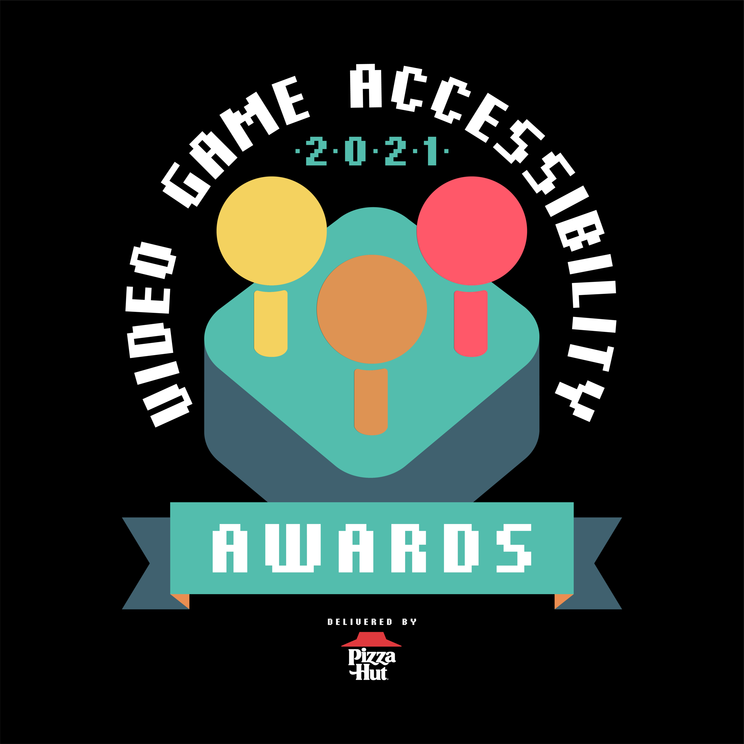
The Challenge: Create a logo and branding that shows the community and inclusiveness of the video game world and those with disabilities.
The Solution: A retro style video game controller that can be easily accessible to those with disabilities as well as show the community that can form from the awesome world of gaming.




Roots & Suds
The Challenge: Create a brand that lets the consumer know they mean sustainability but also quality.
The Solution: A natural color palette with modern icons helps portray the nature aspect while letting the consumer know they are a reliable company and clean.
The hand drawn elements helps the consumer know the brand is down to earth and creates a familiar environment.
Zap! Taco Bar
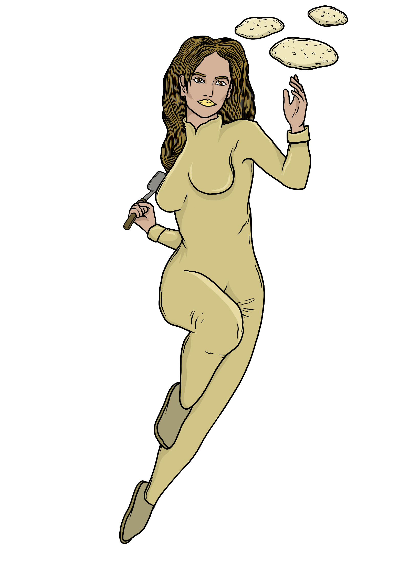
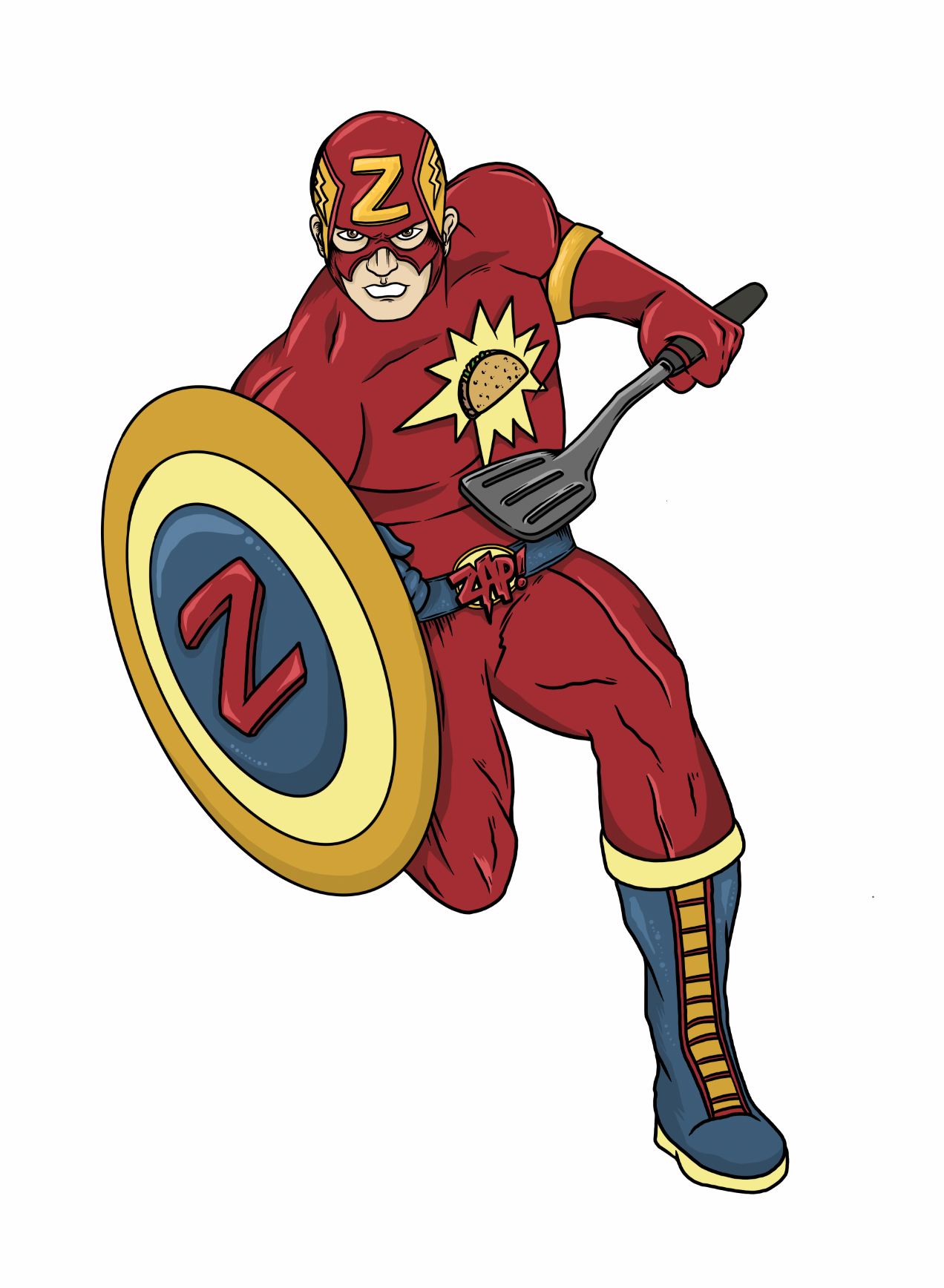
The Challenge: Create a logo and branding that merges the hospitality and comfort of a family style restaurant with the exciting story-telling of comic book stores and Sci-Fi.
The Solution: A badge logo with bright colors reminiscent of childhood super-hero favorites and loved toys. Characters created specifically for Zap! based off of parodies of beloved super-heros as well as some new ones.






More Brewing Company Cargo Van
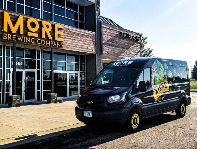
The Challenge: Create an eye catching design that will draw in people’s attention while on the move.
The Solution: Wind-blown hops.






Purity Nail Garden
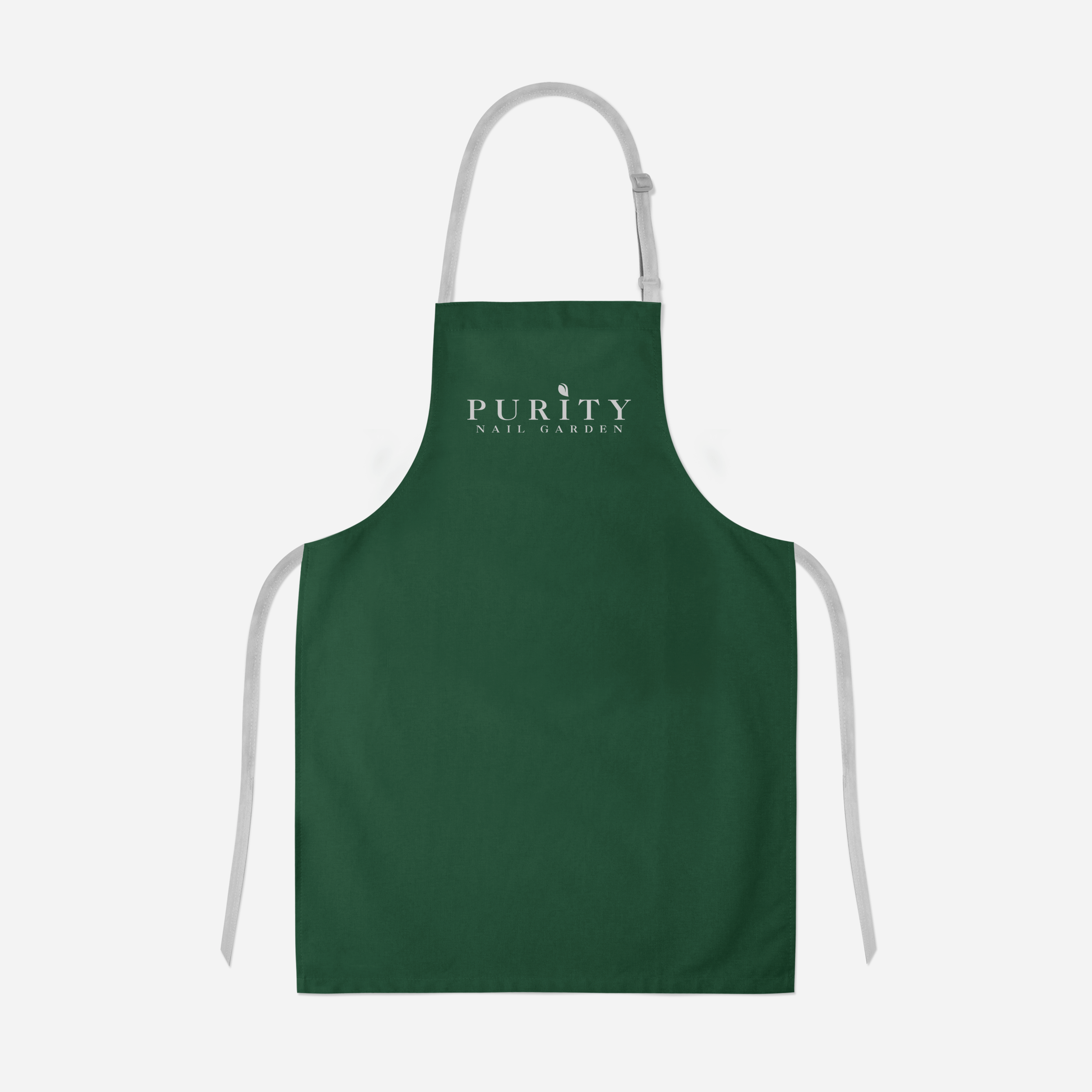
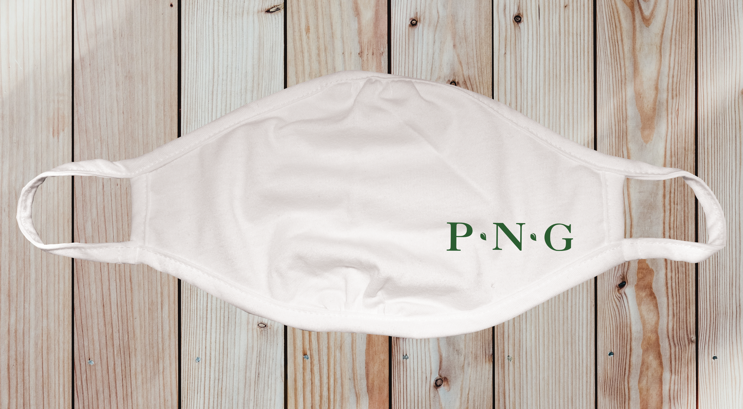
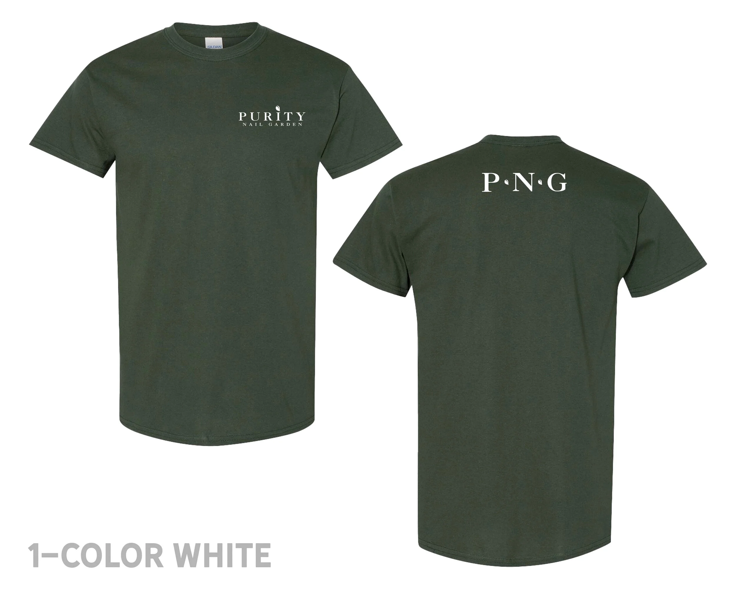
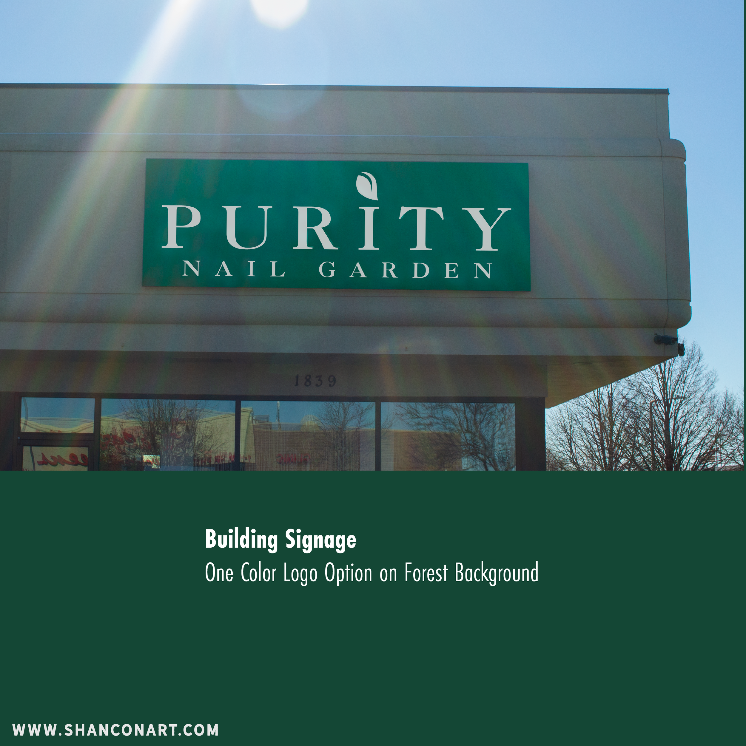
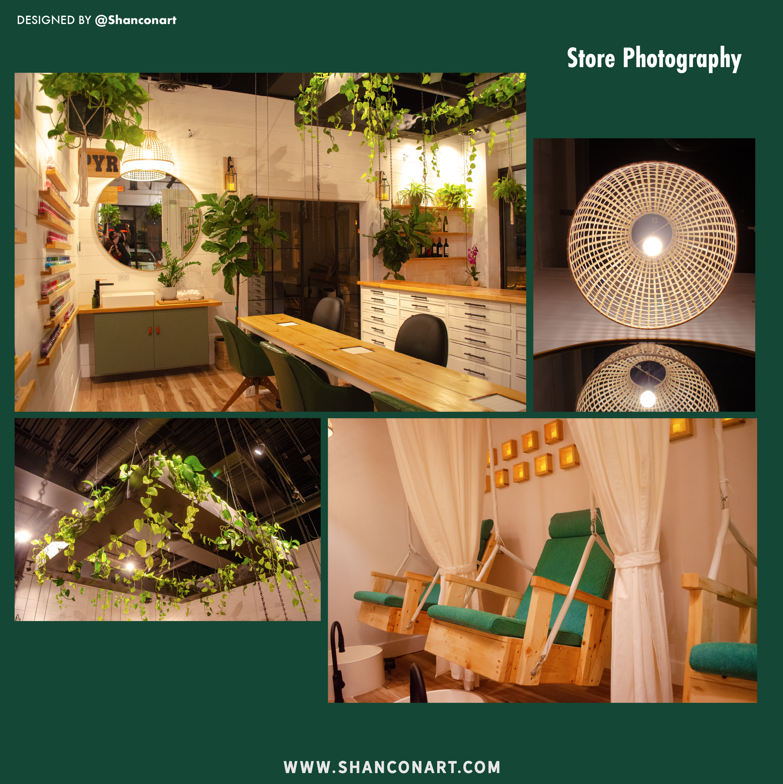
The Challenge: To create a logo and branding that appeals to the luxury side of self care.
The Solution: Similar to luxury fashion brands such as Coach, Chanel, Burberry, etc., I chose a serif font that is both elegant and easy to read. The mark itself, a modern leaf, shows the self-care and nature side of the nail salon. The brand colors are relaxed and scaled back to be easy on the eyes and help relax the luxury lounge feel of the business.







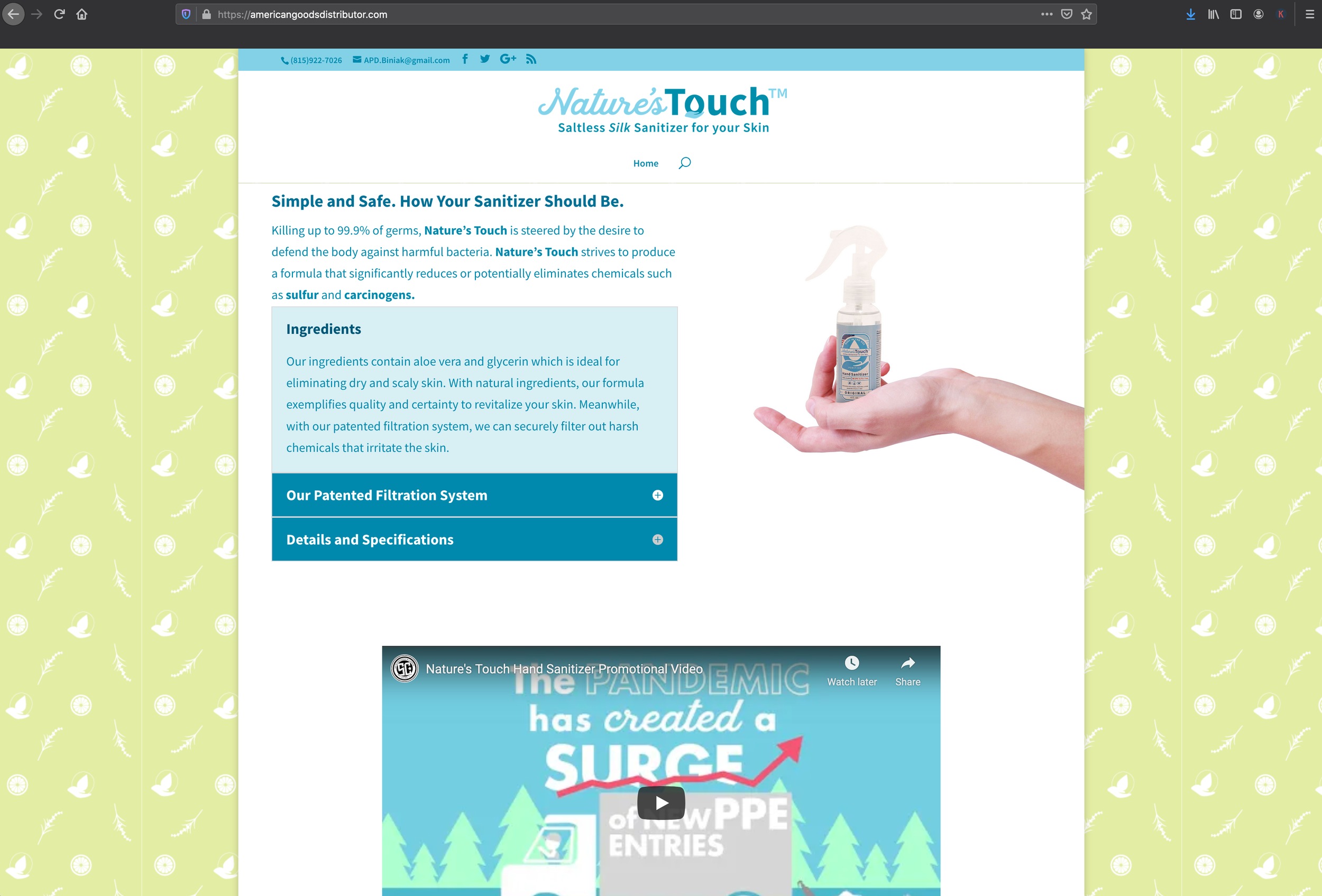
Nature’s Touch Hand Sanitizer
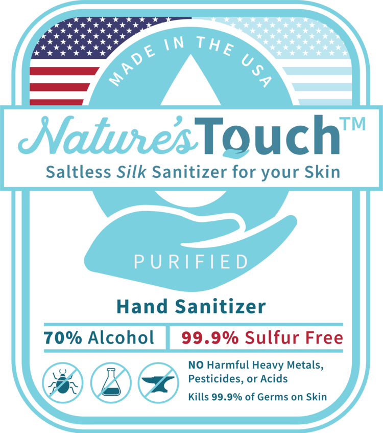
The Challenge: to create a logo and label design to show the cleanliness of Nature’s Touch while
also appealing to the middle-class and union occupations such as firefighters, police officers, and factory workers.
The Solution: The clean and modern logo shows the medical side of Nature’s Touch, with soft blue colors to relate to the medical field.
The badge appeals to the grittier side with the American flag on the forefront of the work force.

Fairlawn Family Dentistry
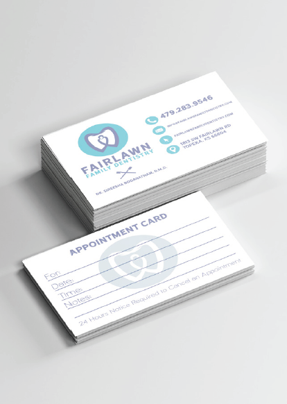
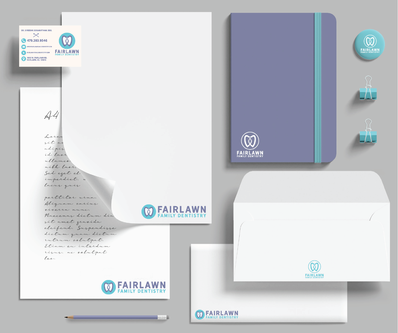
The Challenge: to create a logo that appealed to existing older clients while also appealing to the younger generation. Millennials are seeking medical services from alternate sources more and more frequently such as online doctors.
The Solution: The modern and abstract style logo draws in the younger crowds while the calming violet and traditional blue keeps older clients returning.