

Hey, everyone. My name is Shannon and I am a graphic designer and content creator from Chicago, IL. I started Design Dirt as a way to track my progress as a creator and designer. The world of design is vast and can be scary. My goal is that I can hopefully help other designers just starting out to not feel so alone in the creative shark tank we all want to thrive in. Design Dirt is where I will let other’s in on my secrets, tips, tricks, processes on graphic design, illustration, content creation, and whatever else the industry throws my way.



The Process Behind the Label: Designing My First Beer Can
Beer used to be just a beverage. Now? From the brewing process to the cans themselves, craft beer has become an art form. The craft brew 16oz can has become a canvas for artists around the globe to showcase their creativity while also highlighting the unique liquid inside. This is my journey through designing beer labels for craft breweries in and around Chicago.
Beer used to be just a beverage. Now? From the brewing process to the cans themselves, craft beer has become an art form. The craft brew 16oz can has become a canvas for artists around the globe to showcase their creativity while also highlighting the unique liquid inside. For years, I’ve admired the intricately detailed cans of local breweries, from Revolution’s hop hero artwork, to Half Acre’s vibrant colored nature illustrations. I finally had the opportunity to design some cans of my own thanks to Chicagoland brewery More Brewing Company. This is my journey through designing beer labels.
It all started when More Brewing’s marketing director, Aaron, reached out and asked me if I would be available to work on some labels. We had met briefly years ago through a mutual friend at a coloring book party for Riot Fest. It just goes to show how networking works in mysterious ways; sometimes opportunities spark right away and sometimes it’s years. (This is a key example of why going to events and networking yourself is so important, but that is a blog post for another day.)
As a first timer designing a beer can, I was a little shaky on where to begin. After a little thought, I realized it was not much different than designing anything else. The process would be pretty much the same: sketches, first drafts, final art, mock-ups. I’ve designed mostly for musicians at this point, so I thought of it as an album cover but the beer type was the band.
The first label I was asked to design was called Arketype: Coco Flux. The only direction that I had been given at this point was this was to be more on the simpler side and possibly geometric. For this reason, I decided to do my “sketches” digitally. I used Adobe Illustrator and the pen tool to hash out some quick ideas on separate art boards.
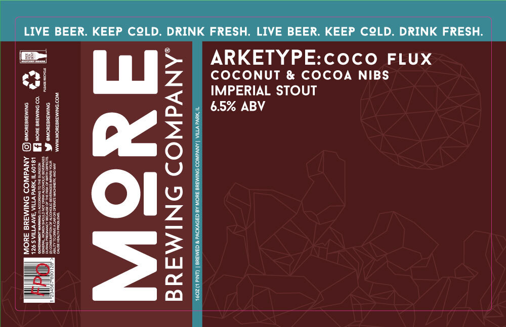
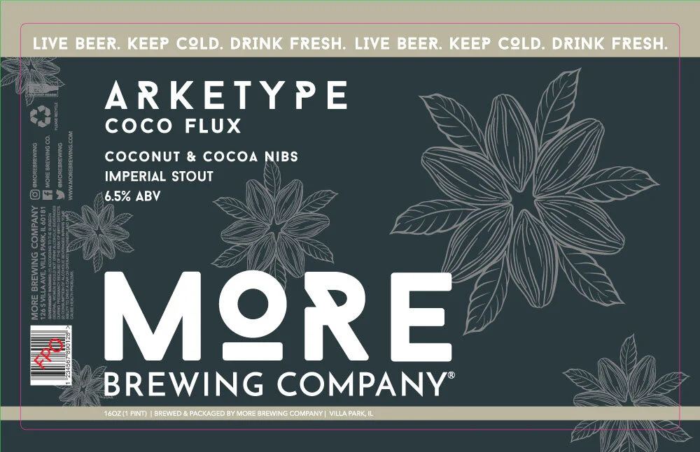

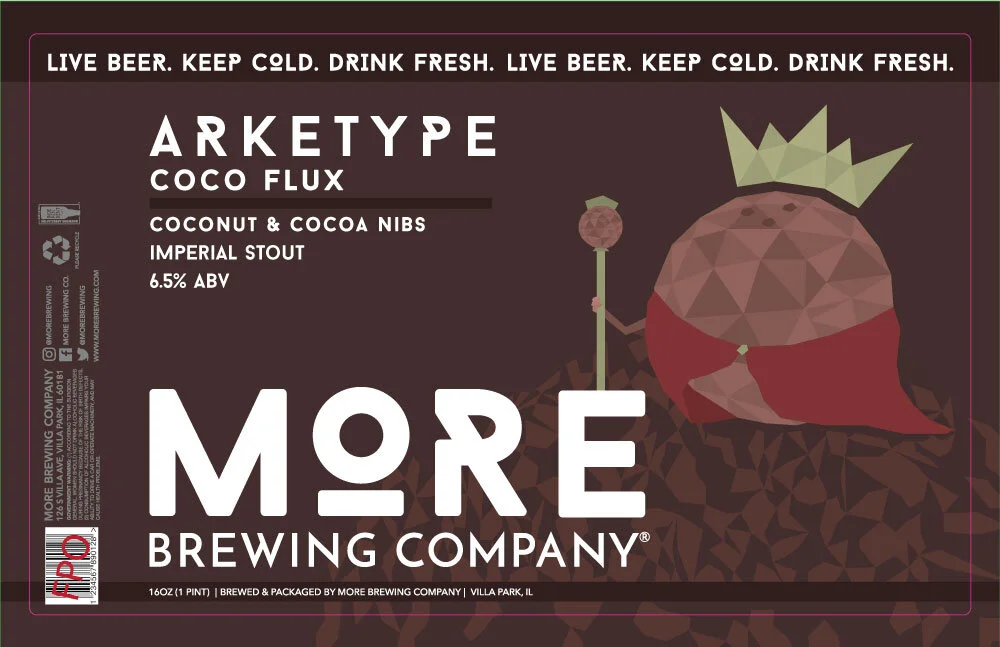
In simple terms, I was nowhere close to the destination. One of the best qualities an artist could ask for in a client is honesty. I’ve always admired when clients are straightforward and let me know right away if something isn’t where it needs to be. It saves time for both the artist and the client’s business in the long run, while also eliminating any unnecessary frustration from not knowing what to produce.
My second round of drafts looked like this…

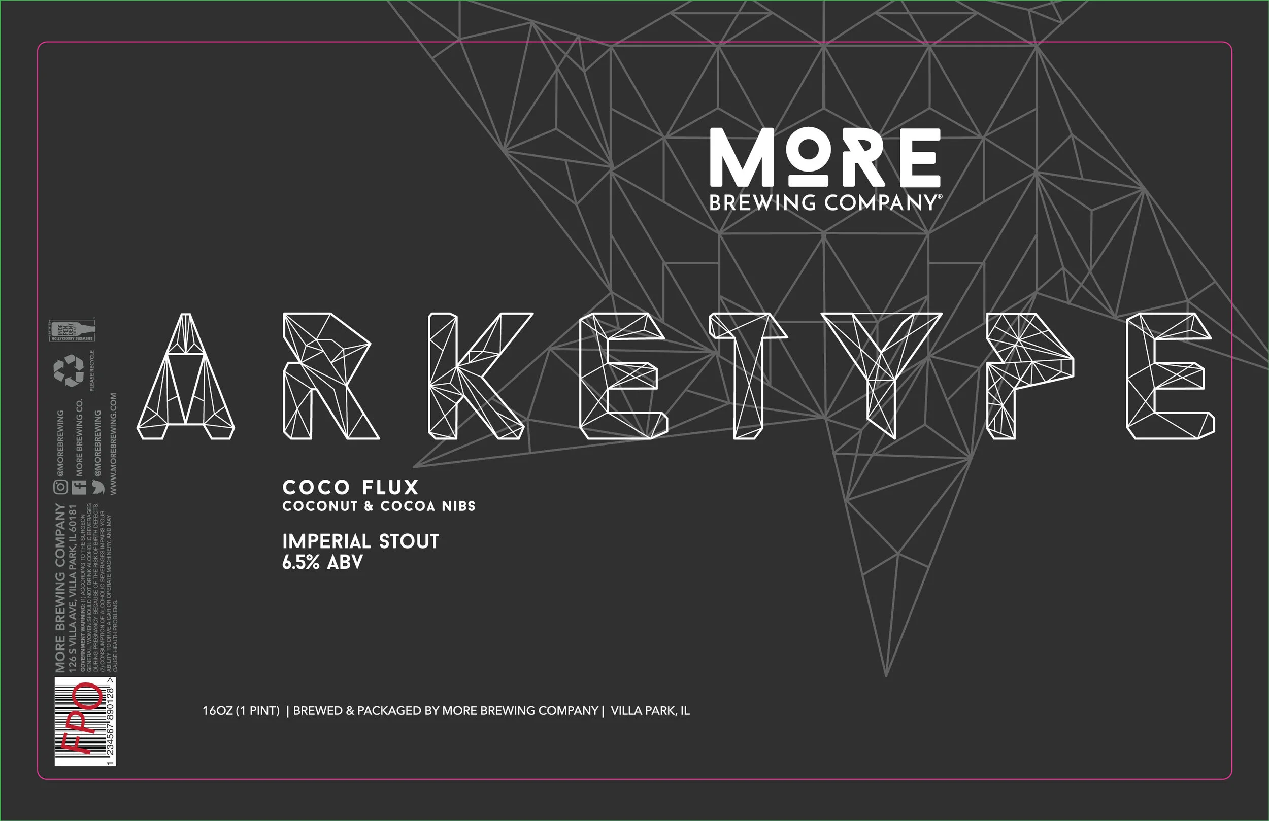
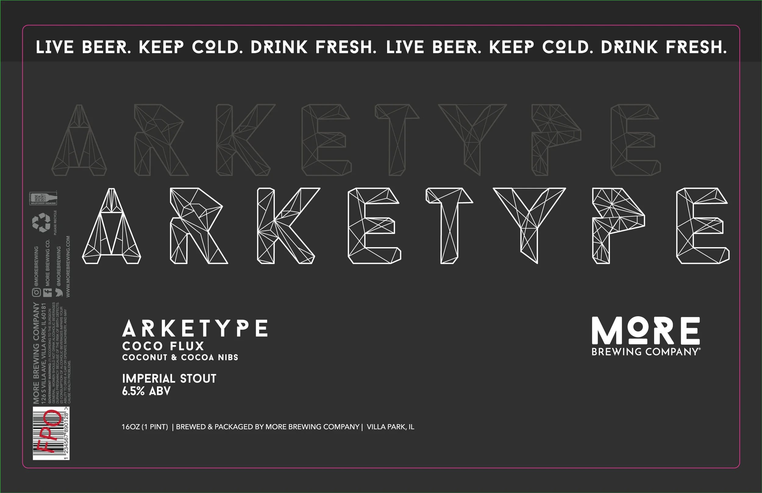

I decided maybe the background isn’t what needed to be the point of concentration, but the typography. Using the pen tool in Illustrator, I created my own geometric typeface based on More’s branding font, while having the background be occupied by a mandala. After a few rounds of tiny edits, we finally ended up with a final version.


The final production of the label itself was done with a metallic silver finish on the letters.

…and with that, my first label was completed.
Designing on the screen is one thing, but seeing your designs come to life into the real world is a whole new type of high. A high I will probably be chasing for a very long time. At the time, I didn’t anticipate doing as many labels as I have in the past few months. Since February of 2020, I’ve designed twenty-two beer labels (and it’s only June, 2020.) If four months could bring this much excitement to an illustrator’s career, I can only hope the future will hold just as many new challenges and rewards.
A huge thank you and shout out to Aaron at More Brewing company for remembering my artwork and giving me the opportunity to work with More. Designing labels for craft beer has been one of the most satisfying projects to date.
Search Posts
-
Apparel and Printing
- Apr 20, 2022 How to Create Artwork for T-Shirts: A Guide for Artists Designing for Screen Print Apr 20, 2022
- Nov 2, 2020 From iPad to Shirt: Halloween Edition Ft. Goof Nov 2, 2020
-
Art Processes
- Apr 20, 2022 How to Create Artwork for T-Shirts: A Guide for Artists Designing for Screen Print Apr 20, 2022
- Nov 2, 2020 From iPad to Shirt: Halloween Edition Ft. Goof Nov 2, 2020
- Sep 2, 2020 Tech Talk: My Tools for Digital Artwork Sep 2, 2020
- Jun 29, 2020 The Process Behind the Label: Designing My First Beer Can Jun 29, 2020
- May 20, 2018 The Process of Designing Posters May 20, 2018
-
Product Reviews
- Sep 2, 2020 Tech Talk: My Tools for Digital Artwork Sep 2, 2020
-
Technology
- Apr 20, 2022 How to Create Artwork for T-Shirts: A Guide for Artists Designing for Screen Print Apr 20, 2022
- Sep 2, 2020 Tech Talk: My Tools for Digital Artwork Sep 2, 2020
Are you an artist that needs to create artwork for screen printed t-shirts? Use this guide to help you set up your artwork files the right way. Explains screen-printing basics and how the method affects your artwork creation.